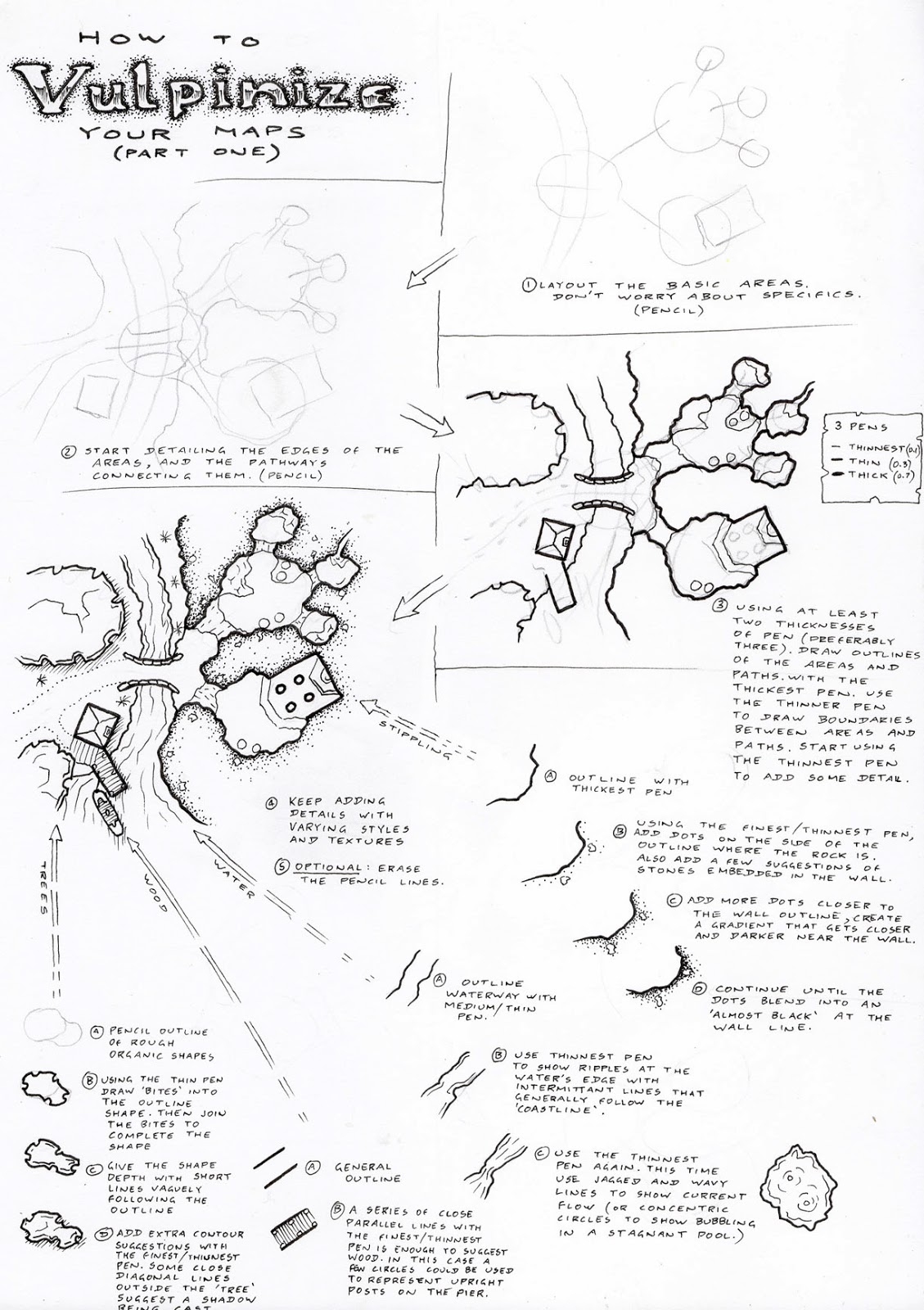
I like good page layout
I spent five years studying and practising calligraphy, under one of the top Australian calligraphers (I feel like Donald Trump when I say that without qualifying it in any way... at the time I remember seeing her work in all sorts of magazines, showcases and exhibits for fine calligraphy work, but now I can't even remember her name... I guess it's one of those things about getting old... I vaguely remember that she was one of the first women to be admitted to a prestigious calligraphy guild in the UK, and one of the few non-British residents at the time also). I'm also a technically qualified web designer, a university trained graphic designer and someone who has done work in both comics and advertising.
The point is that I love a well laid out page. A few days ago, there was an RPGaDay question on "Jaw-dropping Page Layout". I pretty much stated that almost everything in the RPG space is pedestrian, and not worthy of the term "jaw-dropping". I still stand by that, but it's really nice to see some people paying attention to their pages, rather than just cloning old rule sets then adding minor tweaks to claim a degree of originality.
So, when I saw this post from +Patrick Stuart, I was glad to see people paying attention to page layout, functionality and aesthetics.
I still wouldn't say it's jaw-dropping, and it's nothing incredibly innovative, since I've seen a lot of these design features (such as the staggered book sections and the clean white-space in standardised section headers) used in textbooks, technical manuals and more even in games from the 80s and 90s. But it's really nice to see someone utilizing these ideas, and reassembling them for a current gaming product (I stop myself short of saying a "modern gaming product", because it looks like an OSR production).
I also like that there has been a distinct idea to formulate the pages for consistency, and "meta-stability"...the aim here seems to be ensuring a regular appearance to the pages, but allowing a slightly fluid state so that any conflicts between the layout and the content are reduced. My web design background almost sees this like a fluid page design handled by a well-designed CSS.
Apparently, there are going to be some additional posts regarding this, and I look forward to them. I love to see caring artisans, and love to learn about the specific choices they have made and the rationales behind them.
The point is that I love a well laid out page. A few days ago, there was an RPGaDay question on "Jaw-dropping Page Layout". I pretty much stated that almost everything in the RPG space is pedestrian, and not worthy of the term "jaw-dropping". I still stand by that, but it's really nice to see some people paying attention to their pages, rather than just cloning old rule sets then adding minor tweaks to claim a degree of originality.
So, when I saw this post from +Patrick Stuart, I was glad to see people paying attention to page layout, functionality and aesthetics.
(Image appropriated from Patrick's blog)
I also like that there has been a distinct idea to formulate the pages for consistency, and "meta-stability"...the aim here seems to be ensuring a regular appearance to the pages, but allowing a slightly fluid state so that any conflicts between the layout and the content are reduced. My web design background almost sees this like a fluid page design handled by a well-designed CSS.
Apparently, there are going to be some additional posts regarding this, and I look forward to them. I love to see caring artisans, and love to learn about the specific choices they have made and the rationales behind them.


.png)

Comments