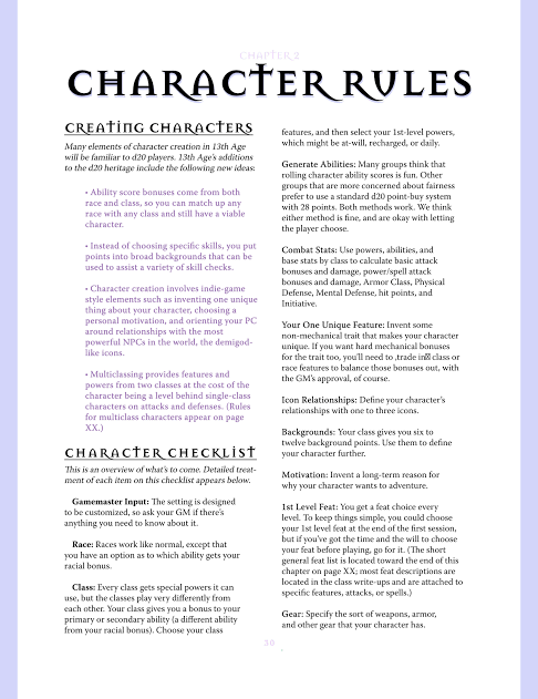
NaGaDeMon / RoleVember 2019 - Page Layouts
Since a big chunk of this game is just being stripped out of the work I've done on "The Law" and "Walkabout", that means I can start laying out pages with meaningful chunks of text on them.
I like doing experimental page layouts that link into the themes of the games I'm working on, because I think there are too many products out there that are plain and vanilla. I'm also a bit annoyed when someone pops up on a forum or Facebook group saying they're got a really innovative page layout, when they've got a standard 2 column layout and all they've done is added a border design.
Standard Layout
 Doing a quick Google search for "rpg page layouts" this one comes up as a sneak prview of page layout for a game. Seriously, are you trying to entice me with how boring this is? Except for maybe the title, it looks like three quarters of the pages in any of the RPGs on my bookshelves.
"Fancy Layout"
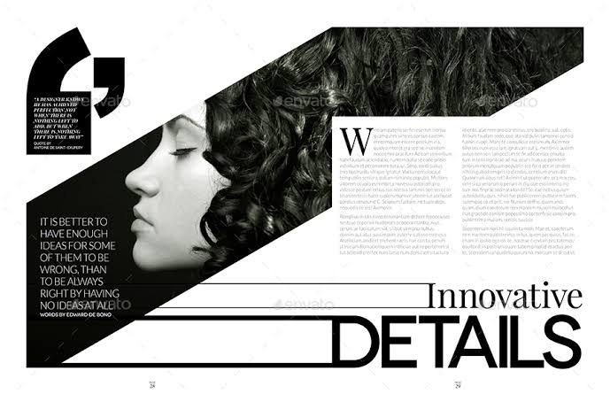
 Yes, there's a nice framing device, but the actual page layout is still "two-column-walls-of-text", and I can only imagine that every second or third page opening has a quarter-page illustration on it (maybe a half page if we're lucky). I didn't specifically go looking for fancy pages, and this was just one of the many examples that came up in my search, so don't crucify me for attacking the game this is from, I'm just considering layout at the moment.
"Ooh... this one's got colour"
 I'm pretty sure this is from L5R, and I'm pretty sure I've got the book on my shelves. It's actually got a bit more going on with the splash of "black ink" on the right, but we're still looking at a two column format. This might be a bit like a vanilla-choc-chip design, no real innovation, but for people who've only ever had straight vanilla this seems groundbreaking.
"Want to feel like a professional page-layout designer?"
 That's what the title associated with this image announced. Seriously? Just slap your text into a generic two-column format with half page images, professional doesn't mean being as boring as flavourless as half of the other products out there (I would have said 90% of other products, but there's colour here and a lot of companies just produce monochrome stuff).
"Now we're getting somewhere"
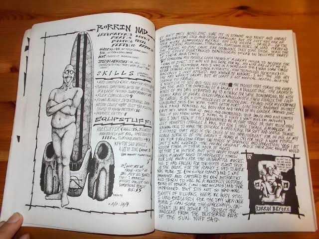 One of the games I've mentioned a few times over the years, HoL was hand written and illustrated. For the late 90s it was a breath of fresh air and certainly stood apart from the other games on the market. As I look these up, it's nice to see other people with similar ideas regarding page layout.
"Lost memories"
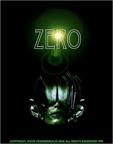 I actually can't remember the page layout of Zero, I just remember that is was a small game for it's time, maybe 64 pages and really heavy with images, and that it made an impact on me at the time. When I saw it on the shelf, I wanted to buy a copy...but by the time I'd been paid and went back to the store, it was gone. In the 20-odd years since, I've heard various people claim to be influenced by it.
"Moving On"
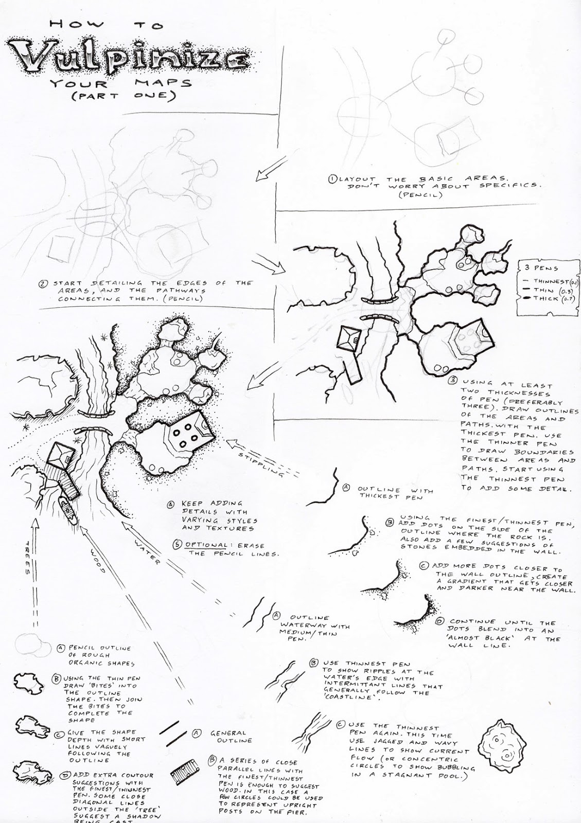
 There are a few good page layout ideas in the rpg world, but trying to find them in a quick search like this isn't easy so I've moved outside game books to find the sort of thing that might be more interesting. Even though it was found in a search for "innovaive page layouts", it's basically just a variant on the two column layout, so it's not as interesting as it would appear at first glance.
"Now we're getting somewhere"
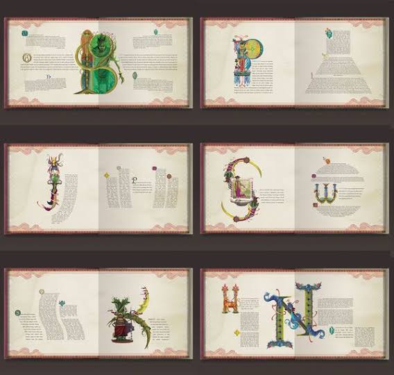 I like this, and in a game about magic, it looks like it could be a good thematic fit. Now the question is whether I could get enough words onto each page if I'm going to work with 32-page comic format booklets.
I've got a lot more to think about here.
I like doing experimental page layouts that link into the themes of the games I'm working on, because I think there are too many products out there that are plain and vanilla. I'm also a bit annoyed when someone pops up on a forum or Facebook group saying they're got a really innovative page layout, when they've got a standard 2 column layout and all they've done is added a border design.
Standard Layout
"Fancy Layout"
"Ooh... this one's got colour"
"Want to feel like a professional page-layout designer?"
"Now we're getting somewhere"
"Lost memories"
"Moving On"
"Now we're getting somewhere"
I've got a lot more to think about here.
.png)
Comments