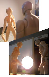
Drawing Process
Just thought I'd share the process I've been going through for this introductory comic.
Step 1. I use artist mannequins to get the poses right. Using a desk lamp or two to get some interesting lighting effects, or in the case of the bottom photo, to set the lighting for an explosion. Once I've taken a few photos in a sequence, I combine them into a page layout.
Step 3. Using a series of costume layout drawings that define the characters, I detail the outlines in pencil. For these characters that means marking the location of armour plates and padding, but in other cases it might mean draping fabrics or other clothing details.
Step 4. Once that feels right, it's time to start inking in the images. Generally my style involves drawing a heavier outline around significant pieces, then detailing those pieces with limited linework in a finer pen. Specifically here, I'm using two types of brush pen (one thicker for the panel outlines, and one thinner for the character element outlines), and two types of felt tipped marker (one thicker for prominent detailing, and one thinner for specific finer details...but both thinner than the thinnest brush pen). With intense lighting behind the characters as the explosion occurs, it felt interesting to put the into silhouette, using the lighting in the mannequin photography, I know where to put the highlights on the bodies to indicate a strongly lit explosive effect between them.
Step 6. Shading is added to the flat colours to give the characters more depth. The specific placement of the shadows is informed by the mannequin photography. A bit of shading is added to the background of each panel to add a bit more visual interest to the images.
Step 7. In addition to shadows, a range of highlights are added to the figures and forms within the page. Again, these highlights are informed by the mannequin photography. If I was going for clear crisp images, this is where I'd leave things... and it's basically where I left one of the images in my last post.
Here's the other images in the sequence. The same general process was used to create them.


.png)

Comments