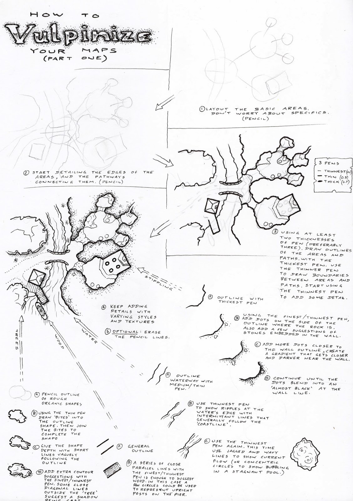
A Colour Mapping Technique (Part 1)
The following few posts use Photoshop, it's what I use, it's what I know. If you can use layers and filters in GIMP, then these techniques might work there as well. I don't know, I don't use it.
Colouring a map requires a starting point, in this case that starting point is a hand illustrated map. I drew up this map for the recent "Dungeon of Lost Coppers" event hosted by Dyson Logos. It was my second attempt at the event, so I wanted to do something dramatically different.
I decided to make the map as open as possible given the existing pre-defined sections of the dungeon. As I continued drawing, I couldn't decide between ruins or an island...I went with the latter.
The basic mapping style is the kind of thing I'd normally do (which coincidentally is pretty similar to the type of map that Dyson normally produces). I didn't want to add too many extra rooms to it, instead opening up the environment as much as possible within the constraints given.
 Since there had already been a few entries by the time I started on this map. I wanted to make it a bit distinctive, different to the entries already in the mix. Hence colouring it, and twisting the map a bit so that everything wasn't just horizontal and vertical.
(This image is a plain black background, with the scanned image of the map tilted and applied to it. The original scan is the white rectangle, the grey rectangle is an added border area I had intended to use before tilting it, and the black is the deep background layer.)
Once adding it into Photoshop, I duplicated the scanned layer image. One of these duplicates had a threshold applied to it so that everything darker than a mid-grey was turned black, and everything lighter was turned white. This tends to make a pretty harsh and stark image, so it is turned down to 50% opacity (the true reason for the grey border on the above image). Both the original image and the modified one are turned into "multiply" layers, that darken anything beneath them.

Next we start adding some textures...first the general texture of the rock. This is done on a layer beneath the drawn maps. The whole layer is filled in with a flat colour, it doesn't matter what the colour is, it's just a placeholder to be manipulated by layer styles. There are a few standard textures that photoshop can apply as layer styles; since I was in a hurry, I just used the pattern overlay called "purple daisies" and then applied a colour overlay of brown with a 50% opacity. It gives a vaguely rocky appearance. I could spend longer on it, trying to get an accurate colour, but something vague is fine to give the rocky impression I need. (Besides, I'm colour blind; if I obsess too much I might make it worse).


There's one bit of the map that just doesn't seem right (circled above), the sand leads up to a secret door on the map, and I don't like it, so I use a large faded eraser to softly remove some of this layer away from the door gradually fading into the sand of the beach as the intact parts of the layer remain.
Next we do the same to get a water effect for all parts of the map that aren't land. (New layer beneath the drawn images but above the beach layer...magic wand selects the wet parts...result is filled, filled area is textured with the "carpet" layer style and slightly colour adjusted to look more watery).
![]()

Starting to look more like an island, and certainly getting closer to what I had originally envisioned...but it's not there yet.
Helpful Hint: When selecting areas with the magic wand tool, use the "Select -> Modify -> Expand Tool" to increase the selected area by a pixel or two. This means that the areas being coloured have edges underneath the drawn lines rather than butting up against them. Anti-aliasing does some strange things when colours are up against one another, so it makes a better transition when the colour spreads underneath the drawn lines.
Colouring a map requires a starting point, in this case that starting point is a hand illustrated map. I drew up this map for the recent "Dungeon of Lost Coppers" event hosted by Dyson Logos. It was my second attempt at the event, so I wanted to do something dramatically different.
I decided to make the map as open as possible given the existing pre-defined sections of the dungeon. As I continued drawing, I couldn't decide between ruins or an island...I went with the latter.
The basic mapping style is the kind of thing I'd normally do (which coincidentally is pretty similar to the type of map that Dyson normally produces). I didn't want to add too many extra rooms to it, instead opening up the environment as much as possible within the constraints given.
(This image is a plain black background, with the scanned image of the map tilted and applied to it. The original scan is the white rectangle, the grey rectangle is an added border area I had intended to use before tilting it, and the black is the deep background layer.)
Once adding it into Photoshop, I duplicated the scanned layer image. One of these duplicates had a threshold applied to it so that everything darker than a mid-grey was turned black, and everything lighter was turned white. This tends to make a pretty harsh and stark image, so it is turned down to 50% opacity (the true reason for the grey border on the above image). Both the original image and the modified one are turned into "multiply" layers, that darken anything beneath them.
Next we start adding some textures...first the general texture of the rock. This is done on a layer beneath the drawn maps. The whole layer is filled in with a flat colour, it doesn't matter what the colour is, it's just a placeholder to be manipulated by layer styles. There are a few standard textures that photoshop can apply as layer styles; since I was in a hurry, I just used the pattern overlay called "purple daisies" and then applied a colour overlay of brown with a 50% opacity. It gives a vaguely rocky appearance. I could spend longer on it, trying to get an accurate colour, but something vague is fine to give the rocky impression I need. (Besides, I'm colour blind; if I obsess too much I might make it worse).
Next I use the magic wand tool to select the island's beaches. I create a new layer beneath the drawn maps, but above the rock; I fill it in with white and add a new layer style. This time the texture is "yellow mums" applied at a 50% opacity, this makes it a lot lighter (and I think it looks more sandy).
There's one bit of the map that just doesn't seem right (circled above), the sand leads up to a secret door on the map, and I don't like it, so I use a large faded eraser to softly remove some of this layer away from the door gradually fading into the sand of the beach as the intact parts of the layer remain.
Next we do the same to get a water effect for all parts of the map that aren't land. (New layer beneath the drawn images but above the beach layer...magic wand selects the wet parts...result is filled, filled area is textured with the "carpet" layer style and slightly colour adjusted to look more watery).
Starting to look more like an island, and certainly getting closer to what I had originally envisioned...but it's not there yet.
Helpful Hint: When selecting areas with the magic wand tool, use the "Select -> Modify -> Expand Tool" to increase the selected area by a pixel or two. This means that the areas being coloured have edges underneath the drawn lines rather than butting up against them. Anti-aliasing does some strange things when colours are up against one another, so it makes a better transition when the colour spreads underneath the drawn lines.
.png)
Comments