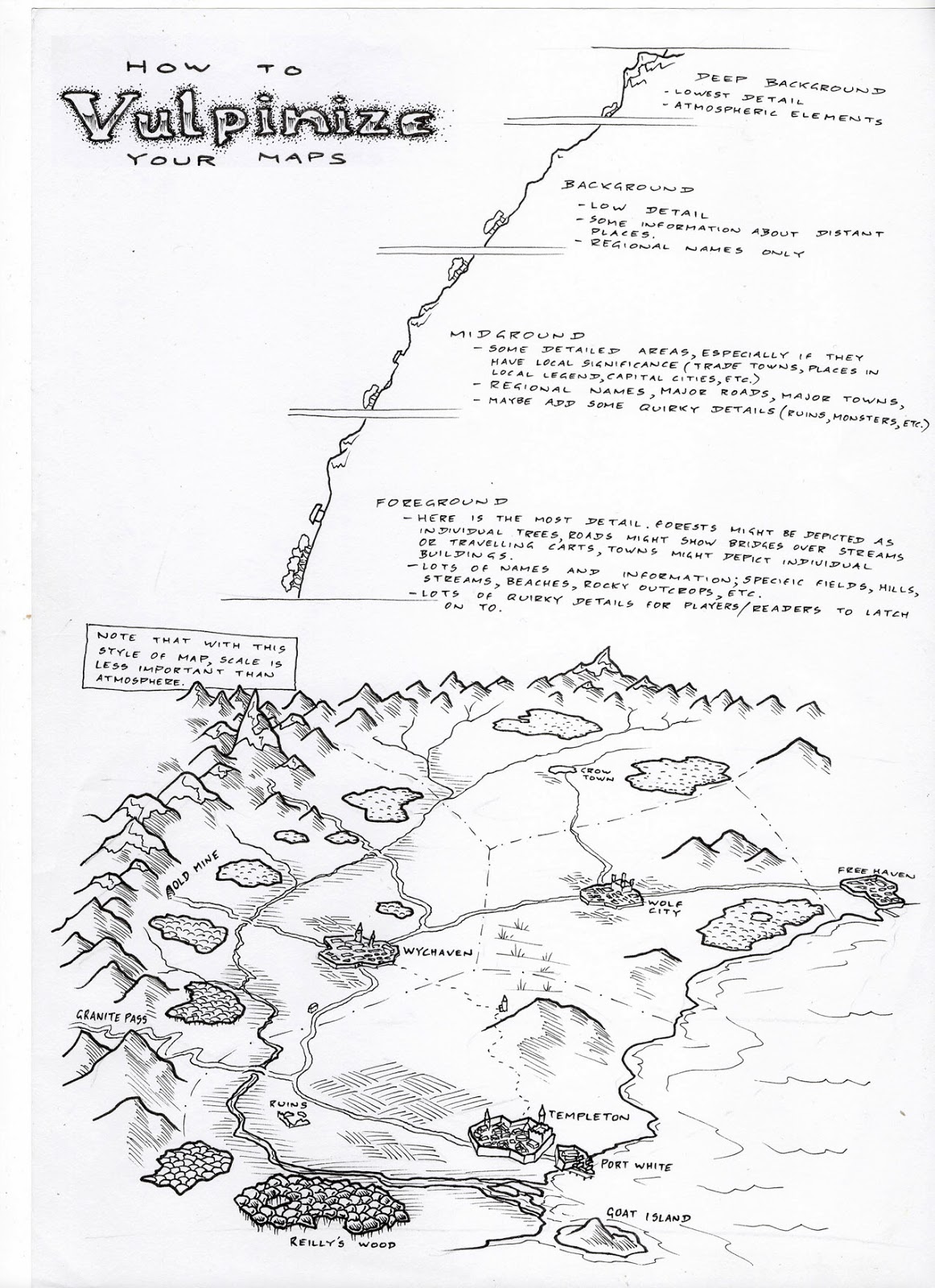
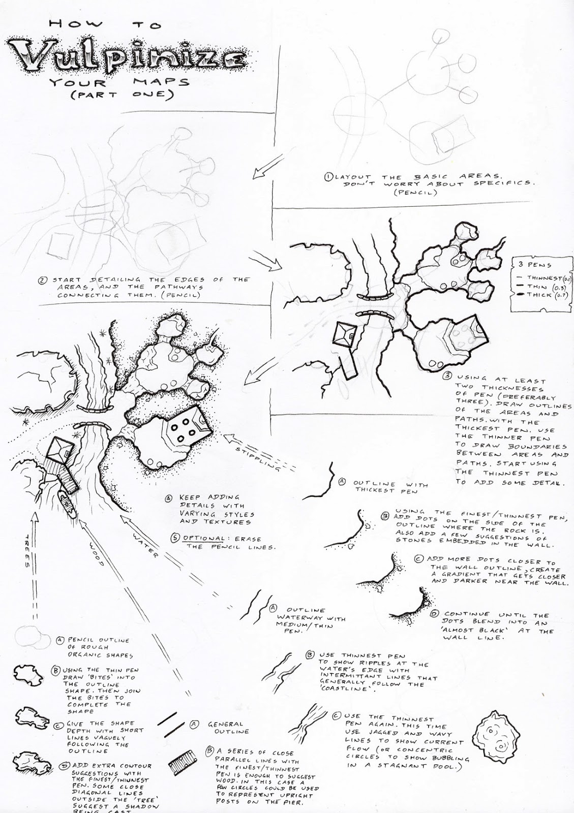
Map Tutorial 16: A wider perspective
Since we've missed a few weeks, there will be a couple of map tutorials each day over the next few days to help clear out the back log. I hope you don't mind.
I drew plenty of maps like this is the mid 90s when I was running a few fantasy campaigns, but as I moved toward tales in modern settings and urban environments I stopped drawing in this style. It's nice to get back to it.
These maps aren't meant to be accurate for scale, towns are typically drawn much larger than they should be, individual trees depicted in forests are also enlarged....but it certainly gives a distinct feel for the region being portrayed.
I might do a few maps like this in the near future. Maybe drawing up a few of my old campaign worlds for people to share/


.png)
Comments