Font Progress
Just a note to let people know how the RPG font project is proceeding.
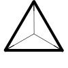
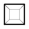
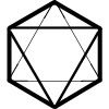


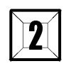
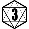
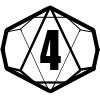
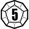

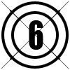
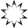


Here's my blank dice glyphs...


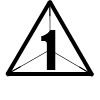
...and here's a few examples with numbers added to them...


...and a few other ideas such as target numbers...


...explosive damage...


...defensive scores...

It's still a long way from completion, but it's starting to come together. Fudge dice will be easy to implement by simply keeping the positive and negative signs and overlapping them over the dice in the same way that the numbers currently are. I could even generate specific dice for "Happy Birthday Robot" in the same manner.
.png)

Comments
All of the glyphs were made according to a similar pattern of ratios to maintain a degree of consistency across the font.
I guess the true art in font design lies in taking the ratios and making them still look "natural".
Basic Specs:
Each glyph is drawn on a 500x500 pixel square.
Glyph Outer shapes are scaled to fit in a circle with a 500 pixel diameter.
An inner circle 250 pixels defines the possible location of a number on the die.
Outermost lines are 20 pixels thick.
Face edges on the "front" of the die are 12 pixels thick.
Face edges on the "back" of the die are typically 5 pixels thick, except where they cross into the 250 pixel circle where numerals might appear (then they drop to 3 pixels thick).
Die corners have been rounded off at a 10 pixel radius (typically) to give a smoother finish.
One of the immediate problems on the d8 is where the outermost lines meet with the edges of faces. Due to line thicknesses, the faces don't seem quite right. I've played around with it a bit.
The d20 is even worse...that's why I haven't even posted a preliminary image for it. I want to ensure the blank dice aren't too busy to read the numeral, and I want to keep the numerals consistent across the font.
Time for some trial and error...